Have you come across the saying, “Photography is akin to painting with light?”?
Consider a drawing or an image without the shadows and light. Sounds impossible, right? That is where value, one of the seven elements of photography, comes in. Shadows and light are crucial in photography and art in general. Everything you can think of in terms of texture, mood, and believability in your work is virtually entirely dependent on one thing — value, making it a crucial attribute in art.
You probably know this already, so you want to know the million-dollar question – what is value in photography? We got you. After hours of research, we have put together information on what value in photography means, how you can measure it, and how to modify it to make your photographs look better. We’ll also give a quick overview of the other crucial elements of photography.
What is Value in Photography?
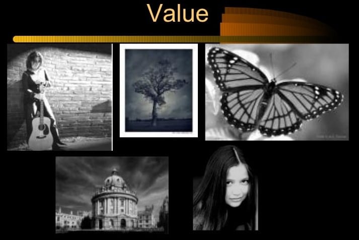
Value describes the lightness or darkness of a color in a photograph. Value ignores the hue or color descriptions (blue, red, yellow), focusing instead on the tint and shade of the paint; a tint is created by adding white to color, while a shade is created by adding black to color.
In photography, value is vital in creating the illusion of light. As you know, we can only see objects because they reflect light into our eyes. Without light, we cannot see. That is why value is crucial in photography and art in general.
The primary tones in a photograph include highlights, whites, mid-tones, blacks, and shadows. Highlights refer to a picture’s bright sections with definition and texture. As the name suggests, whites are the lightest parts with no texture or details, mid-tones are the parts in the middle, and blacks refer to the darkest sections of your photo with no details and texture. At the same time, shadows are the dark areas of the photo with details and texture. To understand this concept better, let’s dive deeper into measuring value.
How to Measure Value
Now that we have gone over the basics of value, let’s look at the next important thing – how do you measure value?
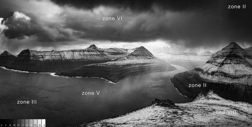
Zone System
Ansel Adams and Fred Archer formulated the Zone System as a photographic technique to help photographers eliminate guesswork from their images. The Zone System is crucial in methodically determining the proper exposure and development. Photographers can easily predict the tonal value of their photos during shoots. It labels the range of the light and dark shades in an image.
The Zone system divides the range of tones into 11 zones, and each zone is represented by a roman number, starting from 0 to X. The far-left tone on the scale (zone 0) is pure black, while white is on the far right (zone x). Each zone equals one stop. Using a wide range of colors in your photo optimizes contrast (more on contrast later). Let’s look at the description of each zone as distinguished by Adams (courtesy of Wikipedia):
Zone System Metering
- Zone 0 – The pure black region with no detail. Total black in print
- Zone I – The near-black region, with slight tonality and no texture
- Zone II – Textured black region. Represents the darkest section of an image with slight detail
- Zone III – Average low materials and low values. Shows fine texture.
- Zone IV – A mid-value. Dark skin or landscape shadows
- Zone V – Middle gray: Average weathered wood.
- Zone VI – Light stone: shadows on the snow in sunlit landscapes
- Zone VII – A high-value tone: shadows in the snow with acute side lighting
- Zone VIII – Lightest tone with texture and delicate values: textured snow
- Zone IX – Slight tone without texture, approaching pure white: glaring snow
- Zone X – The pure white region: paperwhite with no detail
How to Use the Zone System
Picture this; you are off for an adventure to your dream destination, you want to take epic photos for memories, but you realize you did not carry your external light meter. What do you do? Not take pictures? Not a chance. You can still determine the best exposure using just the in-camera light system and the zone system.
How? Place essential items in the scene in the proper zones. These include people’s skin or the sky. Meter and adjust accordingly for the perfect exposure.
Always remember, all meters are calibrated to zone V or 18% (middle gray or the tone of average weathered wood or gray stone). Another critical aspect is that the textural zone begins from zone III through VIII.
The procedure of Using Zone the System
Start by evaluating the scene and analyze how you want your final work to appear. Identify the darkest part of the scene that requires retaining shadow detail, take a meter reading, and place it in zone III. Given that each zone is separated by exactly one stop of exposure, and all meters calibrate to zone V, adjust two stops darker and dial this as your exposure. Use the exposure you’ve set to determine the other vital parts of your scene. Take a meter reading of the brightest part of the scene that needs to retain detail. Ensure it is three stops over your exposure (zone VIII).
What are the Other Elements of Art?
Did you know there are seven elements of photographic art? Value is one element alongside line, shape, form, space, texture, and color. Let’s look at each of them:
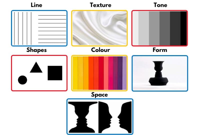
Line
A moving dot – is the standard definition of a line. A line is a straight or curved geometric element considered to be one of the essential elements of art, and rightfully so. Various lines are dotted, solid, interrupted, and implied. They might seem invisible, but lines are all over in photographs.
Shape
Lines form a shape. Enclosed lines form a shape, and they are crucial in photography. Shapes are visually defined by the intersection of lines or values (how light or bright they are compared to the surrounding). When an area contains a shape, it is a positive space, whereas the area around the object defines negative spaces.
Form
Form refers to objects with three dimensions. We already know that shape is two-dimensional. The form has height, width, and depth, thus transforming its shape into three-dimensional. The form types are regular and organic, and like shapes, they also form negative (the area outside the form) and positive (the area occupied by forms) spaces.
The final image of a photograph usually has only height and width. The illusion of depth and dimensionality of an object is then created via variation between the highlights, mid-tones, core shadows, and cast shadows.
Texture
The texture is the surface characteristics of an object. In photography, you can either feel or observe (implied texture) texture. The texture is two-dimensional and is presented in varying tones. Textures can either be rough or smooth.
Light is crucial in emphasizing the roughness or smoothness of a subject; rough textures unevenly reflect light, whereas smooth textures evenly reflect light. Therefore, shadows are also used to emphasize texture in photography.
Color
Color is a light reflection; it can be broken down into three properties: hue, value, and intensity.
Color is crucial in multiple ways in photography, such as emphasizing the mood you want your photo to convey or drawing attention to an object. For instance, you can use purple to symbolize royalty or blue to depict calmness. Additionally, bright colors, such as yellow, are helpful when you want to grab attention.
Frequently Asked Questions
1. What is Light Value?
Light value, also called LV, refers to the amount of light that bounces off a subject.
Generally, in our day-to-day lives, we encounter light in various forms. For instance, the light in the space we are in, and the light bounces off the things around us, such as people, objects, or scenery. The amount of light in the area is luminance, whereas light bouncing off objects is LV.
2. Why do some lights appear brighter than others?
The answer is simple – contrast.
3. What is the contrast?
Contrast refers to the difference between various elements within an image. The common types of contrast are tonal and color contrast. Tonal contrast is the difference between your image’s various tones, from lightest to darkest. On the other hand, color contrast refers to how colors differ from one another.
In the absence of detail and color, tonal contrast comes in handy to build an image. This was especially important in old photography, where the difference between the dark and light tones created the actual image.
Conclusion
We hope we are on the same page now that photography is more than just shooting sharp images. It takes skills, expertise, and mastery of essential photography aspects such as value.
To answer your question, what is value in photography? Value is a measure of the lightness and darkness of a color. Black is the darkest value and white the lightest value.
We understand the technical aspects of photography can take a ton on you, especially if you are a beginner. But we hope that our research will be valuable in your journey.